An architect’s guide to wraparound extensions
Based in Richmond, we are at the epicentre of ‘extensionville’, where many homes aren’t quite big enough for today’s lifestyles and spatial efficiency weighs on homeowners’ minds. We thrive on finding solutions to our clients’ space issues and specialise in designing side-return and wraparound extensions (there are many fantastic examples in our portfolio). Along with the need to refurbish and bring a home up to modern standards, these are the reasons many clients call us and ask for help.
Hands up if you’ve thought any or all of this list?
‘We need more space’
‘We need to open up and let in more light’
‘It’d be great to relate better to the garden’
‘It’d be great if we could hide all of our stuff’
‘I’ve always wanted a laundry and larder space’
‘The kids need bigger bedrooms’
‘We want a guest room, a place for an au pair or elderly relatives perhaps’
The answer to these questions isn’t just to extend, it is to realise space from what you already have. Using clever space planning we extend into redundant areas and integrate key features throughout. Our designs feature, as standard:
- Storage
- More daylight
- Flexible spaces
- Wow factor
Architects can add this value and vision, there is no substitute. The more experienced and on-trend your architect is the more you will benefit and the better your house will look, feel and work.
The majority of homes in London and indeed across the UK are what is commonly known as ‘L shaped’ terraced or semi-detached homes. Built largely during the Victorian era they feature a double-storey main block (the terraced element) with a two-storey ‘back addition’. The main block will consist of a front ‘sitting’ room, and rear reception or dining room with two bedrooms above. The back addition or outrigger, as it is also known, usually includes a kitchen at ground floor and sometimes a bathroom at the rear, above this will be another bedroom or sometimes a bathroom depending on the ground floor arrangement. Whatever the layout the L shaped plan is ubiquitous and very familiar as the archetypal ‘family home’. 3 beds, a bathroom, a kitchen and 2 living spaces. The plan below shows the typical arrangement to illustrate our description:
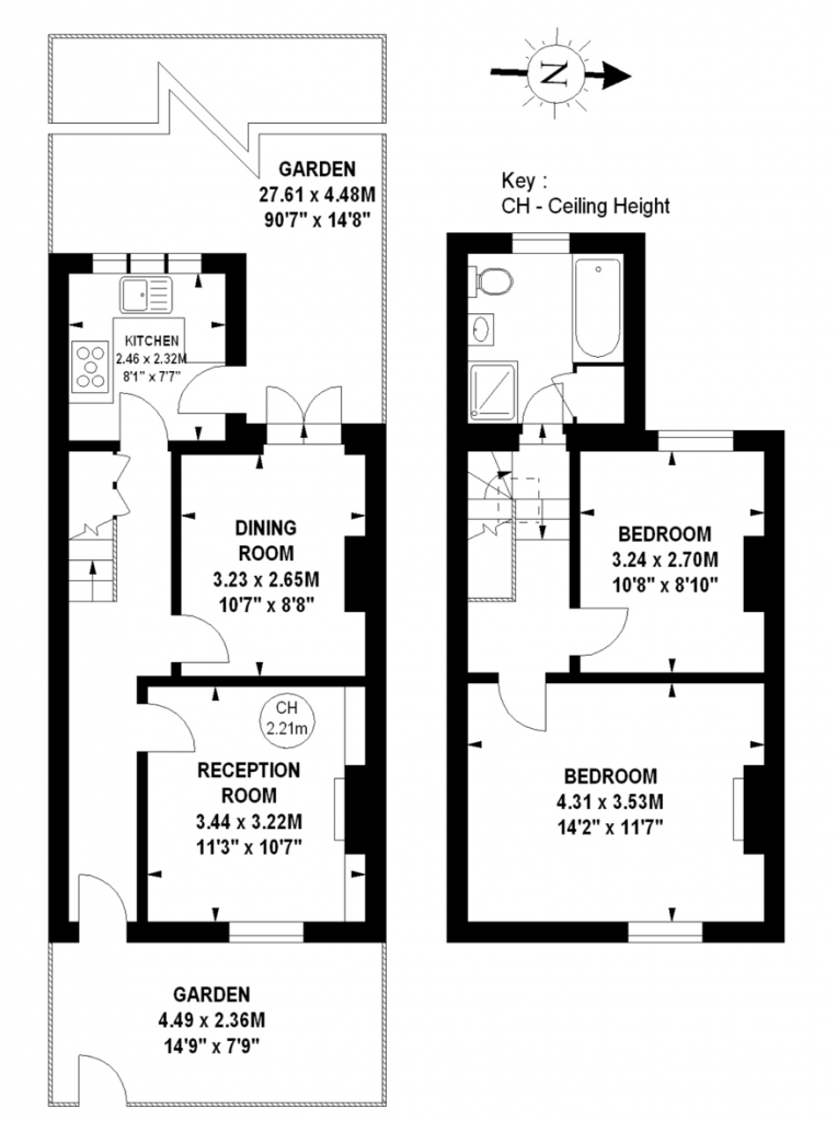
In many cases, the main block has higher ceiling heights than the back addition which will have lower ceilings. The rooms in the back addition are often accessed off half-landings on the staircase. Very often the loft is unused and there will be a redundant space to the side of the back addition a ground floor. Both the loft and this unused garden space make this building type ideal for extension and space planning, this is the bread and butter project for many residential architects particularly in West London where house prices and resale values make it financially viable to renovate, extend and space plan to achieve a brilliant, extended, maximised family home.
WRAPAROUND EXTENSIONS
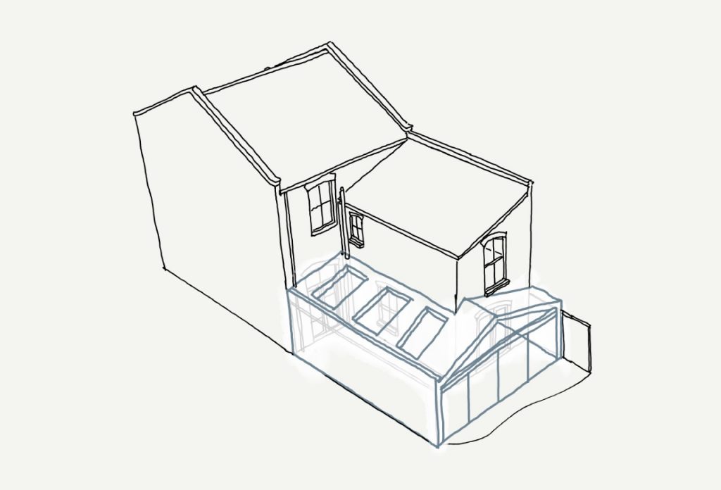
We have designed hundreds of wraparound extensions in our 13-year history. We are specialists and find that they are the cornerstone of a family home construction project. What is a ‘wrap-around’? It’s a ground floor, L shaped extension that fills in the garden to the side and rear of the back addition and is typically combined with a loft conversion and internal space planning to transform the layout and use of the home. This article focuses on the key shapes and aesthetics that the proverbial wrap-around or L-shaped extension might take. These are the main forms but, once the brief is layered over and site constraints accounted for, we find each one becomes quite unique. This keeps the genre fresh and always ‘magazine ready’ if done well!
Below you can see the typical terrace property and area where one adds the new space:
SO, WHAT DETERMINES THE SHAPE?
There are several general shape types for the wraparound, these are determined by site constraints and the clients brief and preferences. Planning and neighbourly concerns can drive the shape too. If adjoining properties have already extended Themselves this may allow a different approach to your brief. We would advise on this during our first meeting with more in-depth advice following the site appraisal and survey. The key design forms (shapes) that we can adopt are:
THE WEDGE
Raking from a lower side (around 2.1m) to a much taller side the wedge is a bold and dramatic shape that is great to use where one needs a lower flank wall (perhaps due to a neighbouring constraint) but could have a taller side too. The advantages are that the taller side and vaulted ceiling create WOW and give a great sense of space. We add glass that sweeps up the slope and we can design a rear elevation of either doors (grand sliders) and/or picture windows. Finishing touches like concealed gutters and downpipes keep things crisp and design focussed.
THE FLAT ROOF
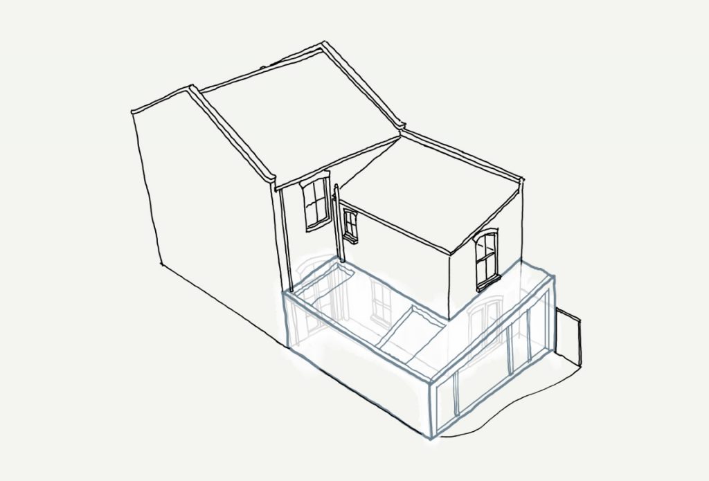
The flat-roofed, simple L-shaped box has high flank walls on both sides and is very simple in concept. With a flat roof capped with an aluminium coping detail and large glazed rear elevation, this is the archetypal shape. It is cost-effective owing to the lack of complexity and allows for roof lights or swathes of glass depending on budget and orientation. Often the structure is hidden and the rear elevation framed with a rendered or clad frame around the wide doors/windows.
THE STEP
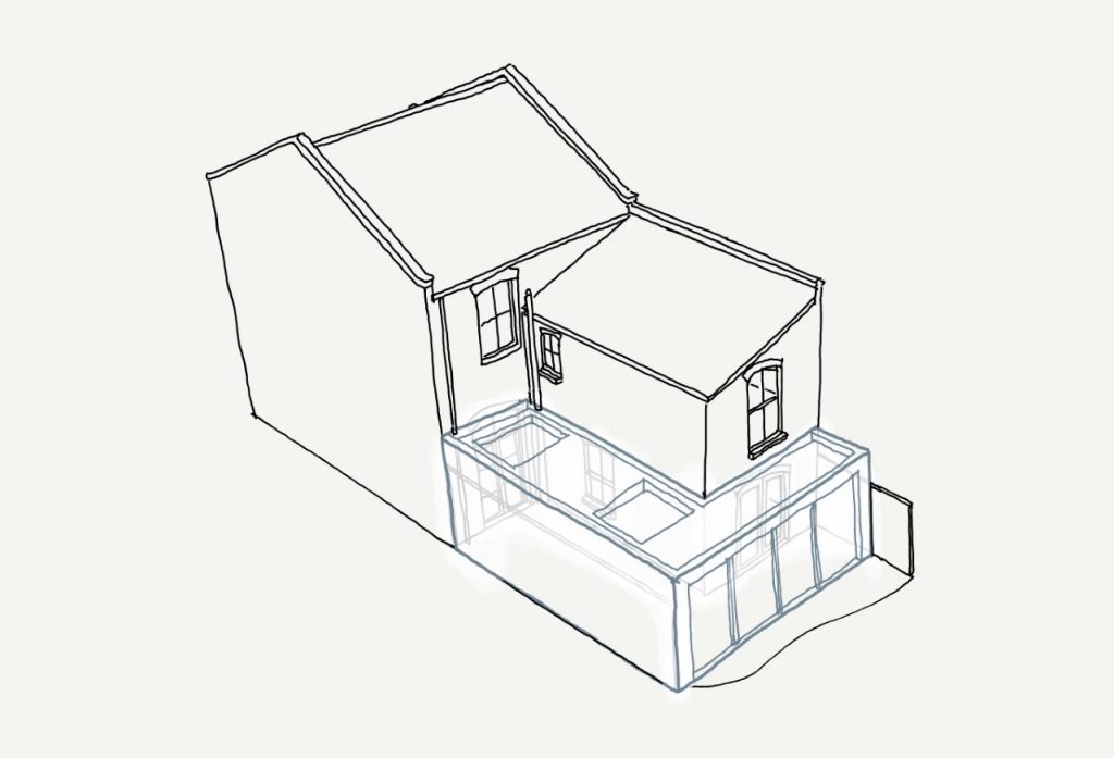
Very similar to the flat roof design above but has a step along one side. We would use this concept where we need to reduce the height along one side due to neighbour considerations or planning restrictions. The step is visible from the rear garden area and is, therefore, a consideration in the glazing layout, it makes the rear elevation interesting and introduces some shape and split areas. The step in the roof can sometimes have a window in the step up and the flat roof areas can have an arrangement of roof lights or a strip of glass where appropriate.

THE LEAN-TO
This is perhaps the most traditional and in-keeping shape but not very design focussed. We don’t often go for this as it introduces a slope down to the rear garden and can lead to shadows on the ceiling due to the various slopes but it has its merits. Where we have used this shape, it is to be in keeping with the roofscape of the house and where planning constraints have dictated this shape. Carefully placed roof lights and traditional materials make this look like it was part of the original build in most cases.
THE APEX
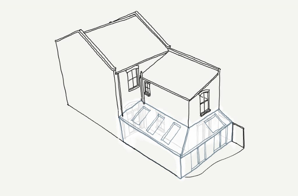
Many examples of this on our site suggest this is popular with clients and solves many problems. The apex roof gives height while the lower flank walls are great for appeasing planners and neighbours too. As with the wedge this design has concealed gutters and exposed structure in many cases. We can introduce frameless glass at the apex for real WOW factor and a triangular glass panel above the rear doors. It’s a part traditional, part contemporary shape that can be industrial or traditionally finished.
WHAT NEXT?
LET US ADVISE YOU. We don’t have a fixed approach or design preference, each of the designs above can be greatly personalised and adjusted to fit the site and client brief. More glass, less glass, zinc roof versus tiled, exposed materials or sleek white minimalism, that’s the fun of the design journey with us. We focus on the materiality and how the glass frames the view to the outside and brings in the daylight to key areas.
There are examples of the wraparound in our portfolio to get you started and a multitude of ideas and completed schemes on the web too. If you’re considering this type of project, do get in touch to arrange an appointment. Bring us your Pinterest boards, Houzz lookbooks or magazine clippings and we will combine these with your brief.


